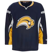
Someone needs to smack the headline writer for this story polluting my ESPN Hockey widget. Buffalo’s new uniforms aren’t controversial, they’re lame. I have no idea why this franchise keeps changing their colors and logos so often. They’ve never won the Cup but I do agree they were robbed of it by the Dallas Stars and Gary Bettman. They were also in horrible financial shape several seasons ago thanks to them being the property of the Adelphia crooks. I don’t think they warrant new jerseys when they can’t stick with anything on a consistent basis. Back to ESPN though. I shouldn’t be surprised at the channel’s use of hyperbole, their parent company is Disney and their broadcasting network ran that highly inaccurate 9/11 crap. Maybe the headline writer or editor believes in intelligent design. Its proponents claim that evolution is still “controversial” with scientists so it only makes sense to extend it to teams in small markets whenever they change their uniforms to bilk their fans.
Now if they want a stink, they should change their name from Sabres to Gold like my alma mater [Marquette] did. Why not? Buffalo is half-way there. They’ve got the same colors for this one, they can just do it without wasting $500,000 of the students’ money researching how much everyone will hate it.
Correction, Late Sept. 18: How could I have completely forgotten this gem of an awful hockey jersey! It only lasted a couple seasons because of all the Gorton’s seafood jokes is my guess and it’s certainly worse than Buffalo. Vancouver’s from the 80s was puzzling but the Islanders’ was more comical as the link will show you.
