It seems WOTC has decided to experiment (or tamper) with a tried-and-true format in order to bring in new D&D players. For 25 years, most published adventures came with the maps and the text giving a synopsis. Sometimes there were visual aids such as illustrations of a room, writings left behind as clues or a puzzle. The monsters the players encountered usually had their key stats laid out or referenced in the appropriate MM if they were “standard” versions. Essential NPCs had their stats, equipment, spells and motivations presented in the back. Several years ago, the NPC format was changed to a new standard established in DMG II. It was longer, more elaborate but it would speed up the game because everything the NPC could do was easily accessible. Personally, I’ve never found this more efficient. As the DM, I was already accustomed to the 3.0 edition’s block style and I would transfer the key stats to these more effective Initiative Cards from the Game Mechanics. Due to my methods, I greatly dislike the new NPC format as it wastes space, splits hairs and tends to obscure the class levels of the NPC or monster.
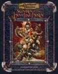
With the release of Return to Castle Ravenloft, the format on the encounters or rooms was changed to a rather dumbed-down style which is why I passed on buying it. Scourge also embraces this shift. For 15 dollars and 32 pages, it is really an eight-page adventure WOTC has given away as a PDF in the recent past. How so? Practically every room or encounter receives at least one whole page describing the contents, occupants and a blown-up map of where any of the monsters may be when the players kick in the door. WOTC needs to give DMs a bit more credit on how to run some rather routine encounters…it is only a goblinoid lair comprised of a dozen rooms. There’s even a blurb showing what the XP rewards are per encounter. That’s definitely a waste of space when there could just be a reference to which page in the DMG answers the question (38 if you didn’t know). Meanwhile the opposition’s hit points are check boxes which is only practical if the DM photocopies the entire adventure. Good thing none of the monsters residing here regenerate or have more than 30 hit points.
Overall, this is only a good adventure for my 11-year-old nephew who is plagued with a short attention span like all kids his age. If WOTC could at least put a banner, sticker or some other warning about this being written for complete newbies, it wouldn’t have been so bad. Otherwise Scourge is similar to the Fantastic Locations series in its emphasis on using minis but without the cool color maps. I’m more afraid of this oversimplified format working its way into Dungeon and other published adventures. My favorite magazine is down to three adventures a month thanks to the DMG II format. This type of layout could boil it down to one heavily padded module with too much white space, throwaway columns and longer, insipid Downer comics. I can feel myself already being nudged into the Goodman Games camp despite the mediocre review I gave them last time.
Bottom Line: If you’re a beginner, then this is the product to start a new campaign after you fix the premise of “some podunk town is looking for adventurers,” which is the plot device for The Seven Samurai and A Bug’s Life. That cliché is almost as tired, lame and implausible as “you meet in a tavern.” If you’re a DM with at least a couple years of experience, this is a waste of money and has no real redeeming value. For the experienced DMs like me who did buy this, I think I can salvage it into a solo adventure or a side trek for two PCs. If I did start a new set of heroes with this, I’d make the players be from the threatened community and beef up the opposition in the caves.
