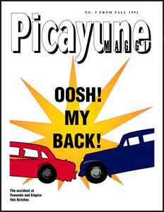
Picayune underwent its first major makeover around this time. While I was un-/underemployed, I ratcheted up making more of them but they still had the amateurish appearance of a newsletter or mock newspaper. By mid 1993 they were shrouded in the ghosts of GDW’s horrendous, drab style without the 1000-words-per-page density. I tried to punch them up with all the free clip art DG had and I think my friends still enjoyed the effort in their mail boxes; e-mail was a rare commodity.
Then Adobe Illustrator 5 appeared and one of its biggest enhancements was instant drop shadows [as shown in the cover above]. Even I could do those easily by using layers but this feature sped it up significantly. While playing with it, I was hit by a bolt of inspiration to make Picayune resemble a magazine instead of a newspaper, namely Entertainment Weekly. It must’ve been the angle or colors with the text I doodle with in the software.
Jose was my first victim and I had a ton to share with him since the Silder wedding, namely the car accident, the TSR lawsuit and my possible plans to relocate to Austin.
This led to finding magazines lying around to model others’ letters after: Newsweek for the Baedkes, Sports Illustrated for Paul and the novel Generation X for Cindy.
Too bad I wasn’t smart enough to just centralize the stories into one giant pool. It would’ve saved me a ton of time and effort, especially when I lacked the time and money in Austin the following year. I did finally do this briefly from 1996-1998 as I consolidated the issue numbers to create a “sense” of continuity.
Still, it was a big step forward in my Macintosh-using skills and it helped me keep my sanity together for next few weeks until I left for Texas. I think it was a large enough change to merit this to be Version 2.0.
