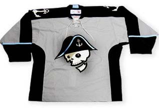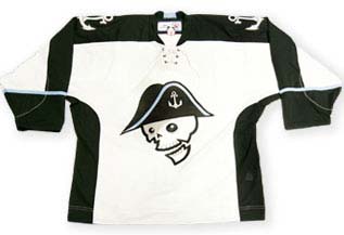

When I was researching my Eric Weinrich story Saturday, I almost forgot about Milwaukee’s August first announcement for their new logo and jersey. I thought the one they’ve had since the 1980s was fine despite the Cap’n Crunch comment I received from a hockey ignoramus at work. I assumed they had to make a change when they joined the AHL but it wasn’t too bad, I only thought losing their old colors for some rather lame ones stunk. I’m still puzzled as to why the AHL keeps two franchises named Admirals too (Norfolk isn’t very good so they have to change despite the idea of there being a large naval fleet sailing on Lake Michigan).
Well for some inane reason the Milwaukee organization changed it again. Thanks to Johnny Depp, pirates are popular again and we all know how the city of beer and brats (pronounced ‘brauts,’ short for brautwurst) was terrorized by Captain Pabst blockading Miller Valley with his armada of Blue Ribbons back in the 1800s. I really hate it when teams pursue short-lived fads such as gang colors (see the Charlotte Hornets and San Jose Sharks) or names everyone will label as dated in three seasons (see the Toronto Raptors). But upon further inspection, I think the new look is more inspired by Tim Burton’s Corpse Bride and The Nightmare before Christmas so they could sell more jerseys through Hot Topic and promoto Goth Night at the Bradley Center.
